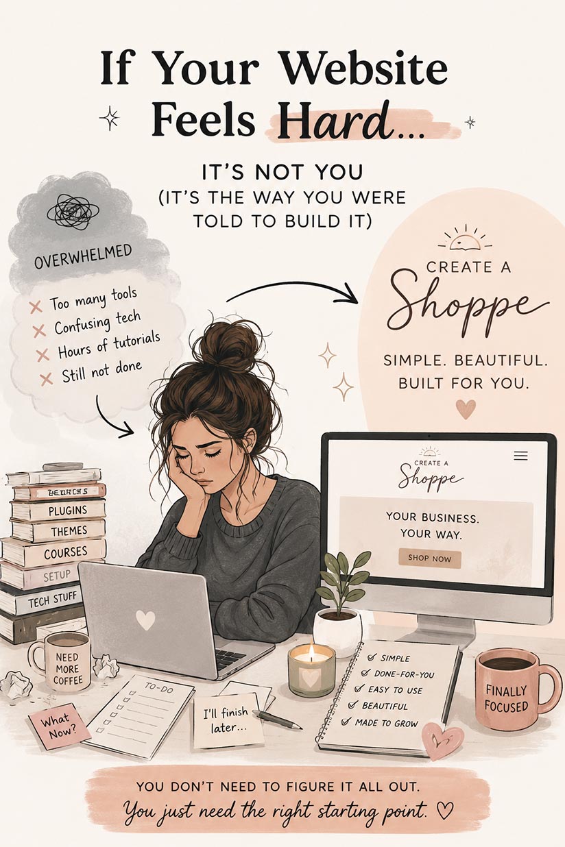

(and you probably don’t even realize it) There’s a pattern behind most underperforming websites. It’s not that they’re ugly.It’s not that the business isn’t good. It’s usually something quieter. Something that makes people pause… hesitate… or leave without taking the next step. Because here’s the truth:Your website isn’t just “there.” It’s either helping you get […]

(and you probably don’t even realize it)
There’s a pattern behind most underperforming websites.
It’s not that they’re ugly.
It’s not that the business isn’t good.
It’s usually something quieter.
Something that makes people pause… hesitate… or leave without taking the next step.
Because here’s the truth:
Your website isn’t just “there.” It’s either helping you get clients — or quietly costing you them.
Let’s talk about the 5 biggest mistakes that do exactly that.
When someone lands on your site, they’re not reading carefully.
They’re scanning. Fast.
If your homepage doesn’t clearly answer:
within seconds… they move on.
A common issue (especially in creative businesses) is trying to sound polished instead of clear.
But vague messaging doesn’t convert.
👉 If someone has to think to understand your site, they won’t stay long enough to figure it out.
This one costs more clients than most people realize.
Things like:
When this information is missing, people fill in the gaps themselves — and usually not in your favor.
Some assume:
Even major website strategy guides emphasize that visitors need enough information to make a decision — otherwise they leave to find it elsewhere.
👉 Clarity reduces hesitation. Hidden info creates it.
Most people don’t read websites — they skim them.
If your site has:
people won’t absorb anything.
Studies and UX best practices consistently show that users scan for key points, not full blocks of text.
That means your site needs:
👉 If your content isn’t skimmable, your message isn’t getting through.
This is one of the biggest conversion killers.
Someone lands on your site. They’re interested.
But then… nothing tells them what to do next.
No clear button.
No direction.
No flow.
And when that happens, people don’t take action — even if they want to.
Many high-converting sites are built around one simple principle:
Every page should lead to one clear next step.
👉 If your website doesn’t guide people, it loses them.
This one is subtle — but powerful.
People are constantly asking (even subconsciously):
If your site is missing:
you create doubt.
And doubt stops action.
Even something as simple as vague testimonials (“she was great!”) instead of outcome-based ones can weaken trust and reduce conversions.
👉 People don’t buy when they’re unsure — they wait, or they leave.
None of these mistakes are dramatic.
They’re small things:
But together, they create friction.
And friction is what makes people leave.
Open your website like you’ve never seen it before and ask:
If any of those answers are “not really”…
you’ve likely found where clients are slipping away.
Your website doesn’t need to be perfect.
But it does need to be:
Because at the end of the day, people don’t leave bad websites…
They leave confusing ones.